In April, The Kiosk hosted a photojournalism contest to tie in with its Spring Photojournalism Workshop series, aimed at giving students the tools to take eye-catching and compelling news photos. The assignment was to take a single photograph that tells an intricate story while paying close attention to aesthetic details and creative captions and hashtags.
To determine the winners, judges from The Kiosk and CUNY SPS staff advisors chose photos that told a visually compelling story with strong captions that reveal deeper details about the subject. The three winners all chose New York City as their subject of choice.
3rd place: Roberta Garbarini-Philippe

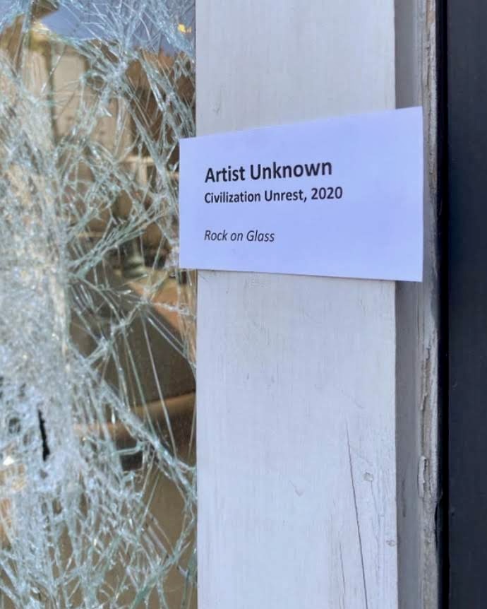
This photo, taken during the 2020 protests in Brooklyn after the death of George Floyd, pairs the destruction of shops and other establishments with a tongue-in-cheek artistic statement. Just like the museum label placed near the broken glass, this photo enshrines the protests as a cross between a historical exhibit and a work of art.
2nd place: Latoya Duncan

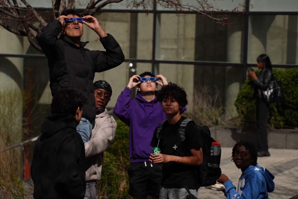
“Because [the 2024 eclipse] was a once in a generation event, I decided that it would be the thing I wanted to capture in some way,” Duncan said during the workshop. “I decided to focus on the people and decided it would tell a good enough story. I had a slew of images of different people.”
One student pointed out that there were several stories being told at once in this photo. Aside from the young men hoisting each other up to view the eclipse, a woman in the background is on her phone, perhaps oblivious to the entire event.
“That’s what makes an intricate story, because there are maybe several things going on,” Nina Hien, photographer and workshop co-host, said. “It doesn’t have to just be one thing that they’re doing. You could write a short story about this and call it ‘The Woman Who Avoided the Eclipse.’”
1st place: Selena Couloufacos

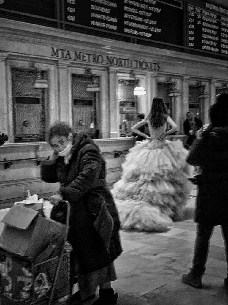
The black and white nature of the winning photograph emphasized the overarching theme of wealth disparity in New York.
“It works for this one, especially because there’s that dichotomy in the photo that’s exemplified with the black and the white,” Katina Paron, Dateline: CUNY editor and workshop co-host said. “Her white dress in the back and her black coat in the front. It all just works together.”
The photo can be read as an anti-fairytale, Hien pointed out. Instead of the good, young princess dressed in white versus the old witch in black, the viewer is inclined to sympathize more with the older woman, who faces the camera, while the woman in the dress remains faceless.
One student also pointed out that the city of New York is very present in the photo, with the Metro North sign indicating that it could only have been taken in Grand Central Station.


