In the age of online journalism, every story needs an image, and for most news, nothing puts a reader in the midst of a story like a photo.
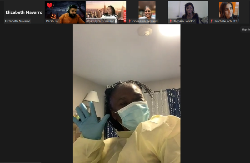
The Kiosk has hosted workshops on journalism in past semesters, but this semester we decided to delve into the elements of photojournalism. In a series of two workshops hosted by CUNY SPS professor and photographer Nina Hien and Dateline: CUNY editor Katina Paron, we examined what makes a great photograph, what sets news photos apart from other photos, and how to follow aesthetic principles to take great photos yourself.
What makes a great news photo? Hien began with the famous photograph of the Situation Room taken by White House Photographer Pete Souza during the raid on Osama bin Laden’s compound in 2011.
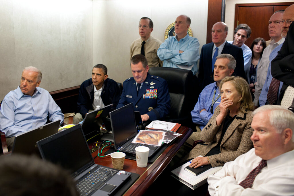
Students pointed out the distinct emotions on people’s faces, the all-star aspect of the White House cabinet, the close quarters and eye-level shot that puts the viewer in the center of the action.
“The action is off the screen,” Hien said during the workshop. “So you don’t even know what’s going on. But you do know. So it’s this odd knowledge about that. There’s a lot of suspense, a lot of gravity.” Hillary Clinton’s hand covering her face adds another layer of emotion, revealing even more about the situation than her face might have, she added.
“During the mission of photographing this, [Souza] took over 100 photographs, all from this cramped spot in the corner of the room,” Hien said. “You just have to respond to the situation and figure it out no matter how constricted it is. But what he did was kind of magic.”
One of the main points Hien covered were the dos and don’ts of photojournalism. According to the National Press Photographers Association’s Code of Ethics, accuracy is the most crucial tenet of photojournalism. Don’t: intentionally alter or influence events, get manipulated by staged photo opportunities, add or remove objects, reenact past events, or stereotype individuals or groups. Do: treat all subjects with respect and dignity, show compassion, and shoot, shoot, shoot.
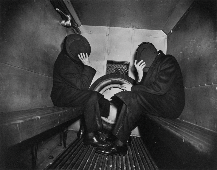
One of Hien’s favorite photojournalists, Weegee, photographed every subject from New York crime scenes to Hollywood celebrities. This photo was taken as two people were arrested and put in the back of a police van in 1942. Weegee’s use of the rule of thirds, dividing up the frame into a 3 x 3 grid and composing the shot to line up with it, helps to grab the viewer’s attention and add a sense of tension, friction, and energy to the photo, Hien said. She also pointed out the sense of mystery in this photo, with the two suspects concealing their faces.
Adding the same grid to other photos (such as the Situation Room photo) often reveals surprising patterns, Hien explained, noticing that Barack Obama’s face lines up with a point on the grid. “This makes me want to tic-tac-toe every photo I see,” she added.
To tie in the lessons from the first workshop to the second, The Kiosk held a photojournalism contest on the subject of a single photo that tells an intricate story. During the workshop, Hien, Paron, and the students discussed what they liked about the winners and the honorable mention picks, using the workshop’s lessons as guidelines to discuss the photos’ mix of storytelling, aesthetic principles, and creative captions and hashtags. Read more about the winning photos here.

