

Overview
Creating an accessible Word document ensures that your content is readable by everyone, including individuals using screen readers or other assistive technologies. In this guide, you’ll find tips on using meaningful hyperlinks, appropriate color contrast, and some general do’s and don’ts.
Video Coming Soon
1. Meaningful Hyperlinks
Avoid using “Click here” or pasting long, raw URLs.
- Accessible Way: Highlight the descriptive text, right-click, and select Link.
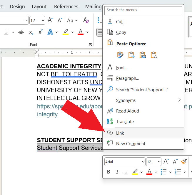
Example: Use [Student Support Services] instead of “Click here to see the access…” This tells the user exactly where the link leads before they click it.
2. Color and Contrast
- High Contrast: Use dark text on a light background. Avoid light grey text or yellow text on white.
- To check if the contrast is enough, use tools like WebAIM Contrast Checker
- Don’t Rely on Color Alone: If you use color to convey meaning (e.g., “Items in red are overdue”), also include a text label (e.g., “Overdue: Item Name”).
3. Accessibility “Don’ts”
- ALL CAPS (Upper Case): Screen readers may read capitalized words letter-by-letter (treating them as acronyms). Visually, capital letters lack the distinct shapes and “ascenders/descenders” of lowercase letters, making them harder for everyone to read quickly.
- Background Highlighting: Highlighters often create poor color contrast, making text disappear for users with low vision. Furthermore, most screen readers do not announce background colors, so the importance of the highlighted text is completely lost on those users.
- Underlining (Non-Links): On the web and in digital documents, underlined text is the universal signifier for a hyperlink. Underlining regular text for emphasis confuses users and makes the document physically harder to read by “cutting through” the bottom of letters like g, j, p, q, and y.
Still have questions? Email us at FacultySupport@sps.cuny.edu. We’re here to help!
Was this helpful?
3 / 2